Design Paper 001 The Sampson Mordan House Mark
Every house mark must do more than look appropriate. It must carry memory, establish tone and work across the practical surfaces of the business. For Sampson Mordan, the challenge was not simply to create a handsome logo, but to develop a mark that could feel historically grounded while remaining clear, legible and useful in the present.
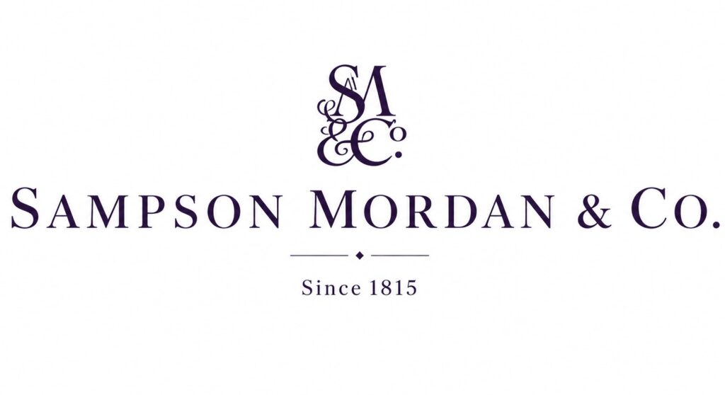
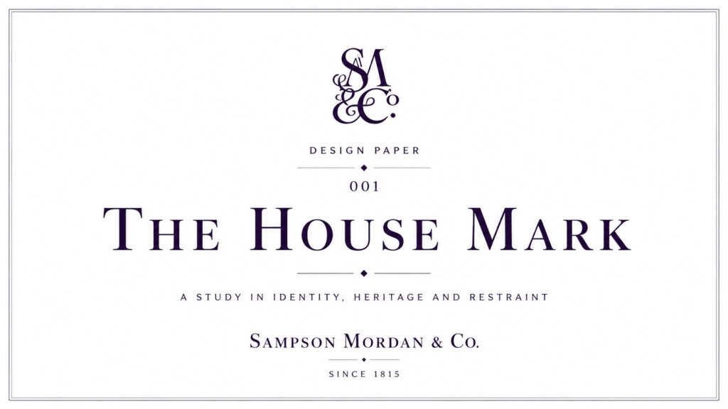
This design paper examines the current Sampson Mordan & Co. logo as a considered house device. Although it draws on the language of historic logo design, it has been created for contemporary use: for the website, digital headers, social media, packaging, printed material and future brand applications. In that sense, it is not a museum reconstruction. It is a working mark for the house as it stands now.
The Brief
The brief was straightforward in wording, but demanding in practice: to create a logo for Sampson Mordan & Co. that feels established, elegant and historically aware, while also functioning cleanly in a modern digital environment.
The mark needed to carry several ideas at once. It needed to suggest heritage without becoming theatrical. It needed to look refined without becoming weak. It needed to feel like a proper house mark rather than a generic retail logo. It also needed to sit naturally within a broader identity system that includes jewellery, silver, objets d’art and gentlemen’s accessories.
The Design Tension
The central tension in the work was this: how does a logo feel historic without looking trapped in the past?
That question shaped the entire study. The answer was not to imitate an old trade card exactly, nor to make the mark minimal to the point of anonymity. Instead, the approach was to work with recognisable historic components — serif lettering, a formal monogram, a measured divider and an establishment line — and refine them into a mark suited to current use.
The Mark as a System
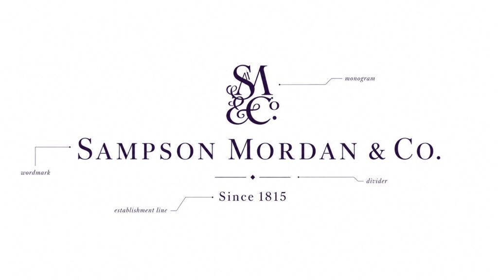
The final logo is best understood not as a single drawing, but as a system of related parts. Each element contributes a distinct role to the identity.
1. The Monogram
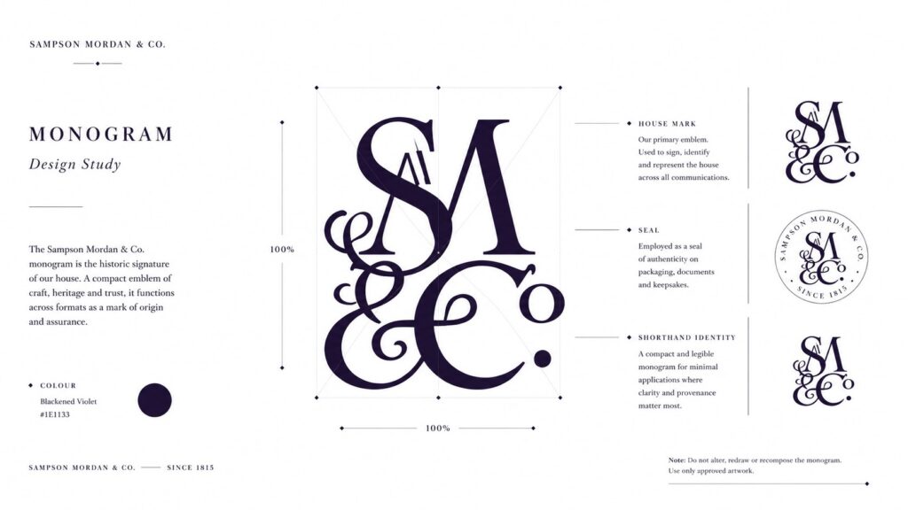
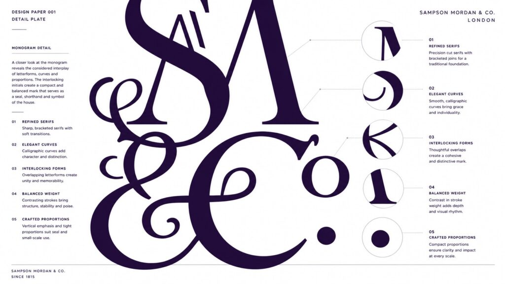
The monogram sits at the top of the composition and acts as the most concentrated expression of the house identity. Interweaving the initials into a compact vertical device gives the logo a sense of inheritance, ceremony and authority. It carries the feeling of a seal, a document mark or a silver stamp.
Importantly, the monogram is not merely decorative. It gives the identity a shorthand form that can be used independently where the full wordmark would be too large or too formal. In time, this element can be applied across profile images, small labels, seals, cards, box lids and other compact surfaces.
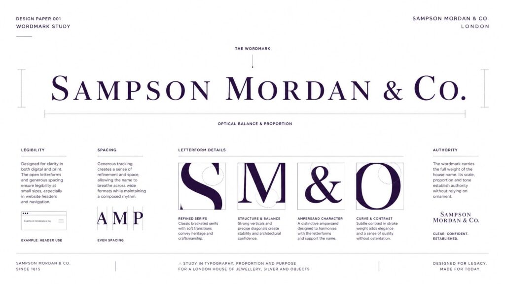
2. The Wordmark
The SAMPSON MORDAN & CO. wordmark is the anchor of the design. Set in a classical serif style, it establishes clarity and authority immediately. Its role is to make the name unmistakable.
The letterforms are generous and widely spaced, which gives the wordmark a calm, confident presence. This spacing helps in two ways. First, it creates a sense of quiet luxury associated with formal house identities. Secondly, it supports legibility in digital use, particularly across homepage headers and wider-format applications.
The wordmark also performs an important strategic role. It ensures that the historic character of the identity does not depend on ornament alone. Even without the monogram, the house name remains strong, poised and complete.
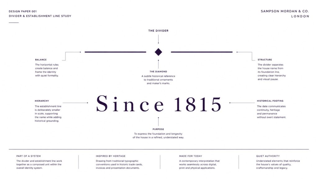
3. The Divider
Beneath the wordmark sits a restrained divider: two fine horizontal lines separated by a small diamond device. This is a modest detail, but it performs several useful functions.
Visually, it creates a pause between the principal name and the establishment line below. Structurally, it helps organise the composition. Symbolically, it adds a note of formality associated with certificates, engraved stationery and historic presentation pieces.
The divider is particularly important because it prevents the lower line from appearing detached or secondary in a weak sense. Instead, it gives the entire mark a measured hierarchy.
4. The Establishment Line
Since 1815 sits beneath the divider as the foundation line of the logo. Its role is not to behave like an advertising slogan, but to quietly communicate the house’s public historical footing.
Using the establishment date in this restrained way strengthens the identity without overloading it. It roots the mark in time and reinforces the sense that Sampson Mordan is a house with history, continuity and depth. The scale is intentionally smaller than the principal name, allowing the date to support rather than dominate.
Colour and Tone
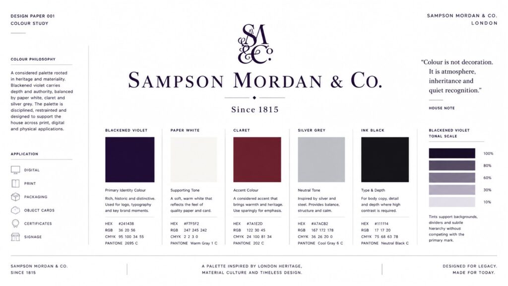
The mark is presented here in blackened violet on a white background. This choice matters. Pure black would have worked, but blackened violet gives the mark greater character and softness without sacrificing seriousness. It introduces subtle richness while preserving restraint.
On white, the effect is clean, archival and legible. It allows the details of the monogram and serif forms to remain sharp, while also making the overall identity feel suitable for both editorial and luxury contexts.
Composition and Hierarchy
One of the strengths of the final composition is its vertical order. The monogram introduces personality. The wordmark states the house clearly. The divider creates structure. The establishment line completes the identity with calm historical authority.
That order matters because it mirrors the way the brand should be understood. The house has a mark, a name and a historical footing. Each layer builds on the one above it.
Historic Language, Modern Use
Although the design takes cues from historic logo styles, it has been shaped by current needs. It must read on screen, scale effectively, remain recognisable in reduced sizes and provide a stable base for future brand materials.
This is where the distinction becomes important. The logo is historic in tone, but contemporary in purpose. It is not trying to pretend it belongs to a printed trade directory of the nineteenth century. It is designed to belong to a twenty-first-century house that values history and intends to use it intelligently.
Applications
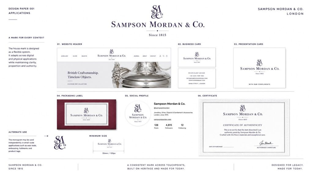
The present mark has been designed to work across a broad range of house applications. These include:
- website homepage and sticky header
- journal and design paper features
- social profile imagery
- presentation cards and printed inserts
- packaging labels and box lids
- certificates and accompanying documentation
- future editorial material and branded graphics
The monogram and full logo can also be separated into a flexible system, allowing different levels of formality depending on the context.
Why This Matters
A house identity is one of the few design decisions that appears everywhere. It touches the website, the objects, the packaging, the printed word and the public memory of the brand. For that reason, even a relatively simple logo deserves proper consideration.
This design paper records that consideration. By breaking the mark into its component parts, we can see that its strength does not come from any single flourish. It comes from the relationship between the elements: the monogram’s character, the wordmark’s clarity, the divider’s order and the establishment line’s quiet authority.
House Note
The result is a logo that behaves as a working house mark: historically informed, visually composed and practically adaptable. It gives Sampson Mordan a clear identity in the present while leaving room for the wider visual language of the house to develop around it.
Frequently Asked Questions
What is a design paper?
A design paper is a structured editorial study that explains the thinking behind a visual decision. In this case, it documents the reasoning behind the Sampson Mordan house mark.
Why does the logo include Since 1815?
Since 1815 is used as the public-facing establishment line for Sampson Mordan. Within the logo, it acts as a supporting historical statement rather than a slogan.
Why use a monogram as well as a wordmark?
The monogram provides a compact symbolic form of the house identity, while the wordmark ensures the full name remains clear and authoritative.
Why was blackened violet chosen?
Blackened violet brings softness and depth to the mark while retaining the seriousness and legibility required for a house identity.
Where will this logo be used?
The logo is intended for digital, editorial and physical brand applications, including the website, social channels, packaging and printed house materials.

Recent Comments